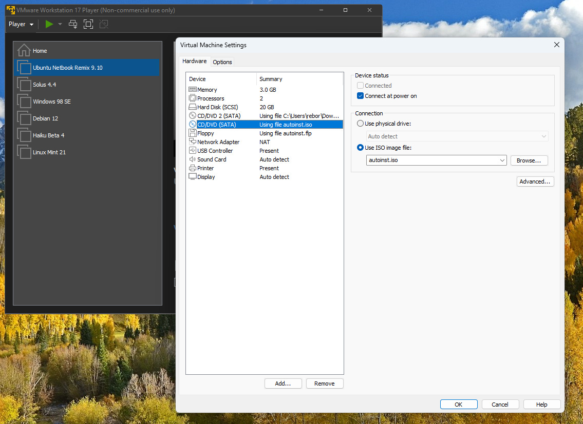
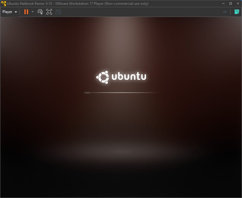
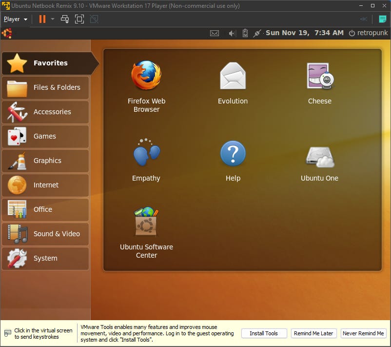
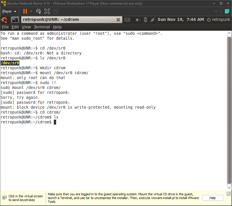
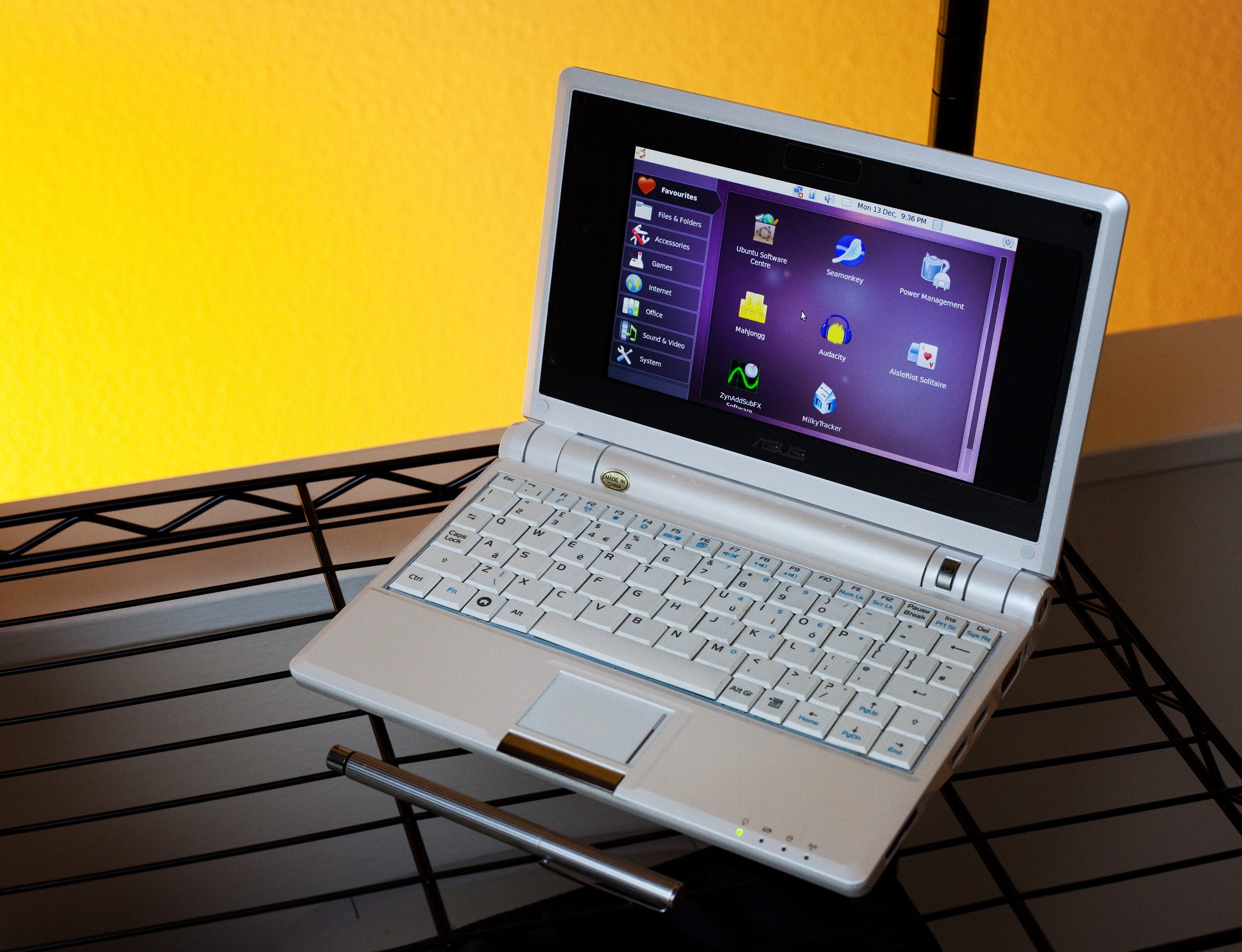
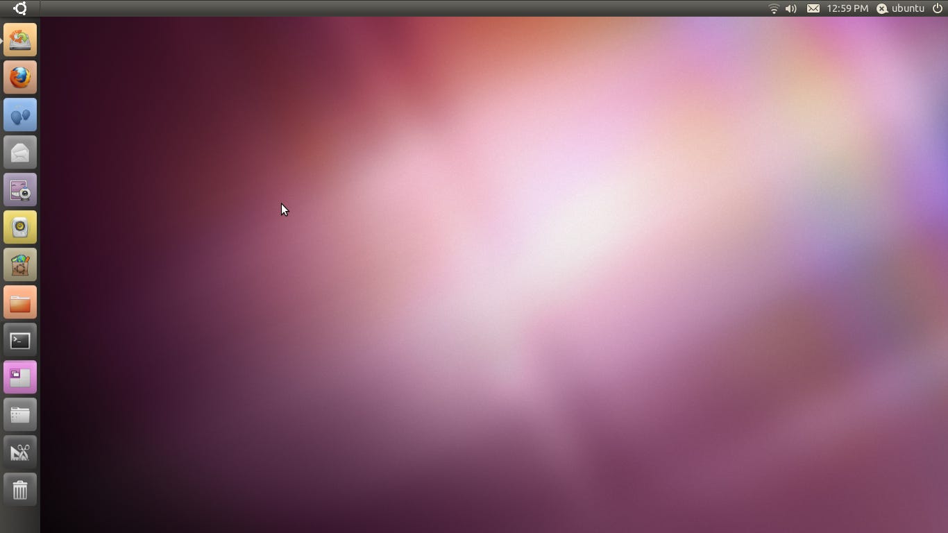
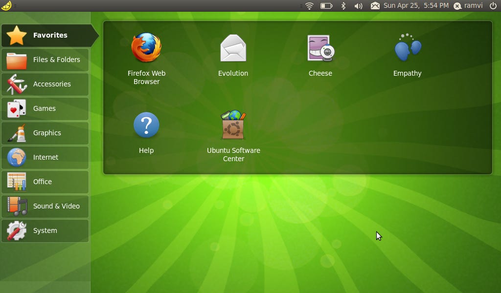
With the rise of the netbook in the late 2000s the world had a need. You see, modern desktop operating systems of the time were getting heavier, and heavier. New desktop visual effects and graphics in systems like Windows Vista and Mac OS X meant you needed a machine that was beefy enough to keep up with them, and therein lies the problem. Netbooks were specifically designed to NOT be that. They were designed to be small and lightweight (as compared to laptops of the time), but what they gained in portability they sacrificed in power and performance. What the world needed was a solution to the problem that this created. Sure, many netbook manufactures figured out a decent enough workaround by shipping their products with Windows XP, but it wasn’t always the best experience. So it was in 2008 when Canonical — the South Africa-based company behind the venerable Ubuntu — threw its hat in the ring. Enter, the Ubuntu Netbook Remix! A brief history of the Ubuntu Netbook RemixIf you haven’t already, you may want to read the article on getting started with netbooks for a good primer on the subject. When the earliest netbooks came out, they shipped with things like Windows XP or Xandros Linux. However, with the immediate success of the form factor, the market was ripe for new developers to come along and give us options! At this point, Ubuntu was a rising star among Linux distributions, but it hadn’t hit that 2009/2010 level of success that led to it being regarded by many as the most popular distribution around. In 2008, with the release of version 8.04 “Hardy Heron”, Canonical released the Ubuntu Netbook Remix (UNR). The UNR was a joint project between Canonical and the fine folks over at the Intel-owned Moblin (Mobile Linux) project — an early ancestor to the modern alternative mobile operating system, Sailfish OS. It aimed to optimize Ubuntu to work better on Intel Atom-based machines, of which many (if not all) netbooks were. The Ubuntu Netbook Remix saw some success and was even offered as an option for the preinstalled OS on several netbooks such as Dell’s Inspiron Mini 10v, the Toshiba NB100, Acer’s Aspire One line, and Asus’ Eee PC. The project was renamed in 2010 to the Ubuntu Netbook Edition (UNE) and saw some changes that would give users an indication as to the future direction of the Ubuntu project as a whole. The final release of UNE was in late 2010 with Ubuntu 10.10 “Maverick Meerkat”. The following April it would be discontinued as UNE 10.10 was already moving into Unity territory. With Unity becoming the default desktop environment for Ubuntu in 11.04, and the death of the netbook on the horizon, the Netbook Edition ceased to exist. Trying out UNR 9.10For this article I decided to virtualize UNR 9.10 “Karmic Koala” with VMWare Workstation Player on my Windows desktop. While creating the VM I selected the ISO file that I got from the Ubuntu Archives and VMWare decided that it was just going to go ahead and install it without any user input. This is a feature called Easy Install. It may work well enough most of the time, but on these older systems it most certainly does not. It results in the system not loading properly and erroring out before the installation starts. Unfortunately, there’s no toggle or setting in the preferences to turn this feature off. Instead, you have to go into the VM settings and manually remove the virtual optical and floppy drives labeled autoinst.iso and autoinst.flp respectively. After removing those disk images, the system will boot into the installer as you would expect. One issue I did run into had to do with keyboard input. I’m not sure if it had to do with VMWare or with this older version of Ubuntu, but I noticed that if I started typing too fast the installer would register one keypress as six (see the user creation screenshot below). This actually carried over into the installed system as well, however it was not present in the 10.10 install I did later. 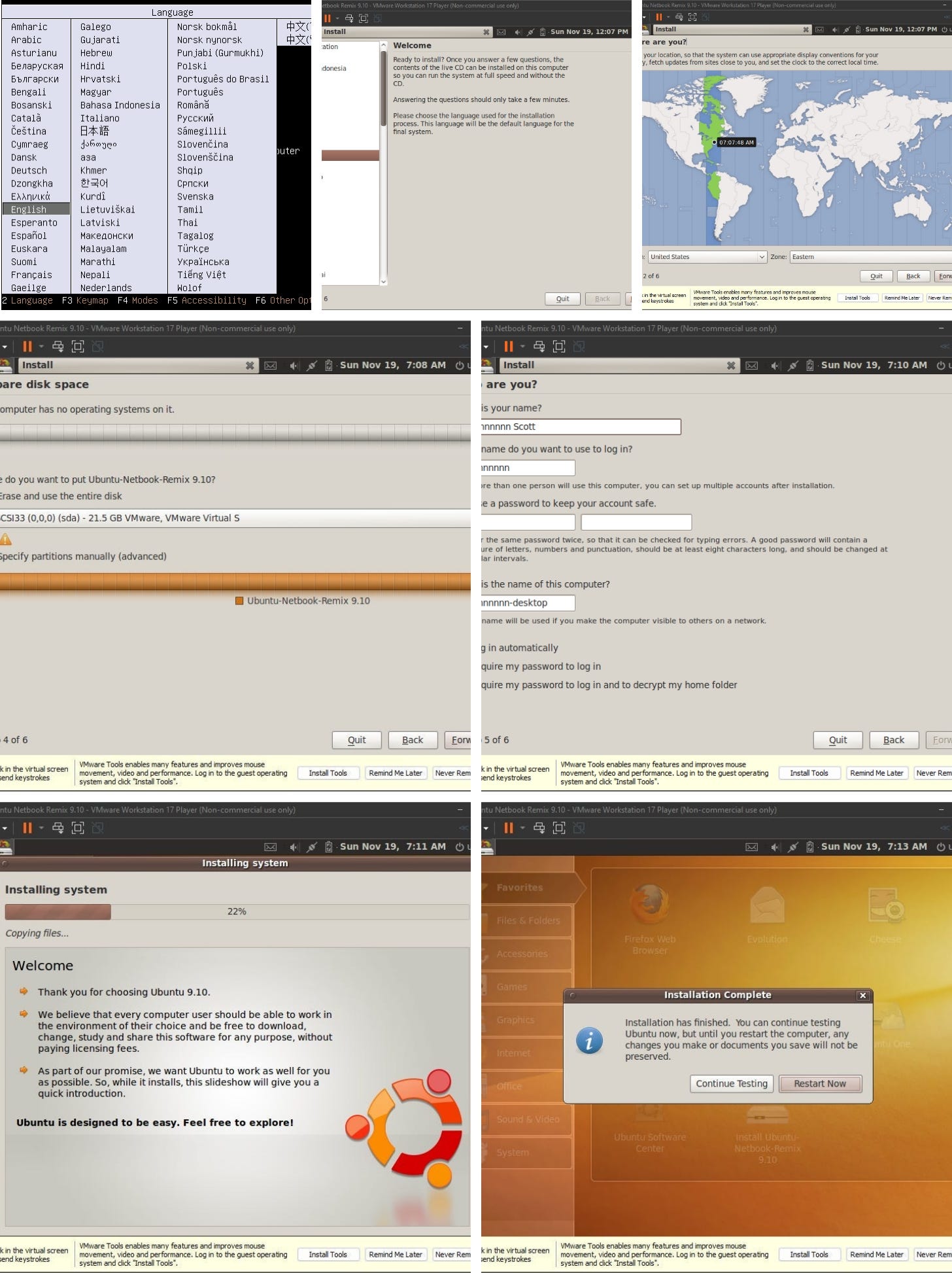 Walking through the installation process It took a little while to finish, but once it did I rebooted the VM. A black screen with the Ubuntu logo flashed for a few seconds and then we were greeted with the old Ubuntu splash screen that I’ve not seen in a very, very long time. Once signed in, we get our first glimpse of the netbook remix interface. Instead of a traditional desktop you get number of categories down the left side of the screen which correspond to the Applications and System menus in Gnome 2. The rest of the screen is essentially a folder with your applications in each of those categories. The next step was to install VMWare Tools to get a more native resolution and things like that. However, when I tried this, I could not get it to work. Navigating to where the CD should have been in both Nautilus and in the terminal revealed nothing. Also, it’s possible I did this wrong in the terminal. It’s been a good long while since I tried to mount an optical drive so if I messed it up let me know. I gave up after a few minutes as having a better resolution wasn’t a huge deal, especially considering the tiny screens that netbooks tended to have. Next, I wanted to check the version of Firefox this system shipped with. It appeared to be version 3.5.3 from 2009. Not surprisingly, it’s pretty much useless. The first thing you see when you launch Firefox is an SSL warning, so I figured I’d head over to The Old Net and try that. It loads as it should, but it appears that they are having some trouble on their end. 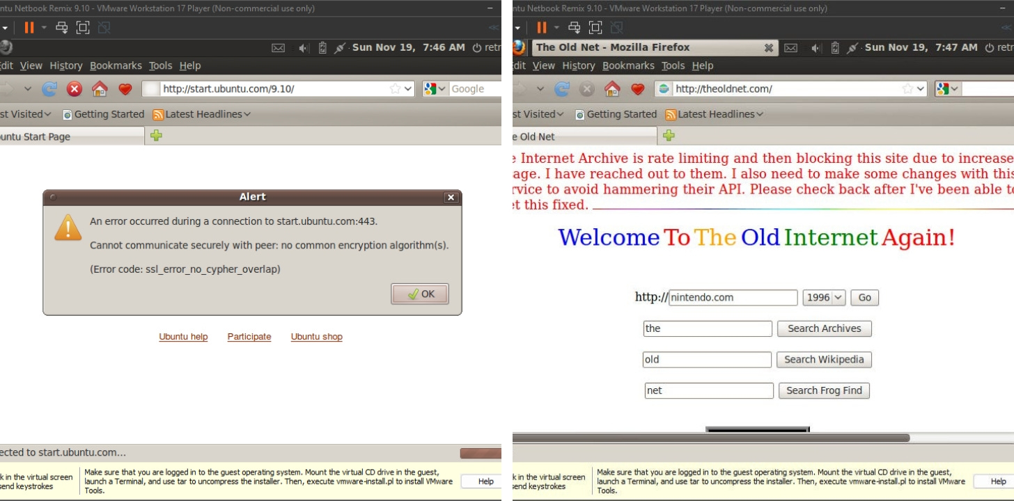 Not surprisingly, Firefox is too old to work with modern websites, but it seems the Old Net is down too. Sad day. At this point, I should probably mention that applications launch in full screen mode only. You can’t tile or overlap your windows. Even programs like Tomboy Notes (known today as Gnote) which opens each note in a new window does this. 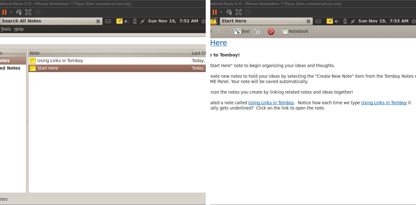 Applications open in full screen. No floating or window tiling here. Now, when I first used UNR I thought it was a single application kind of system, but then I remembered that this came out in 2009 and multitasking had been a thing for a very long time. The way UNR handles multiple windows at once is by creating a new icon for each one in the top panel. As shown below, Firefox, Blackjack, and Rhythmbox are all open and running. Simply click on the icon when you want to go to that window. Click on the Ubuntu logo to go back to the “desktop”/launcher. This also applies to when you have multiple instances of the same program running (like with Tomboy Notes pictured above). To close a window or program, click the X in the white box that serves as the title bar. I won’t waste your time talking about each program that comes installed on UNR 9.10. Instead, here are some screenshots to give you an idea. The one thing that’s worth noticing is that this was a couple of years before LibreOffice started so we were still rocking OpenOffice. This particular version was 3.1. It predated the Oracle acquisition so it’s a build from good ol’ Sun Microsystems. 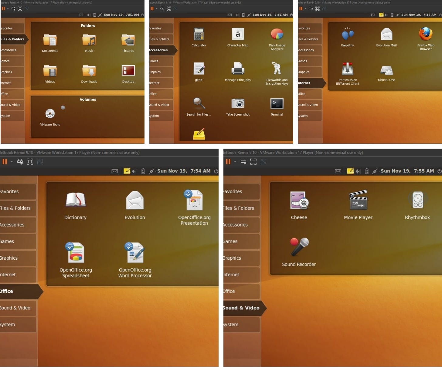 Going through some of the categories Trying to try out UNE 10.10Next, I thought I would take a look at the version I used for a little while in 2010, Ubuntu Netbook Edition 10.10. Once again, after removing the Easy Install drives from the VM settings, setup was straightforward. This was after the introduction of the Ambiance theme and Ubuntu’s branding change where they went to a more simplified logo. This installer should look much more like what many of us are used to as it continued to be used for several years after 2010. 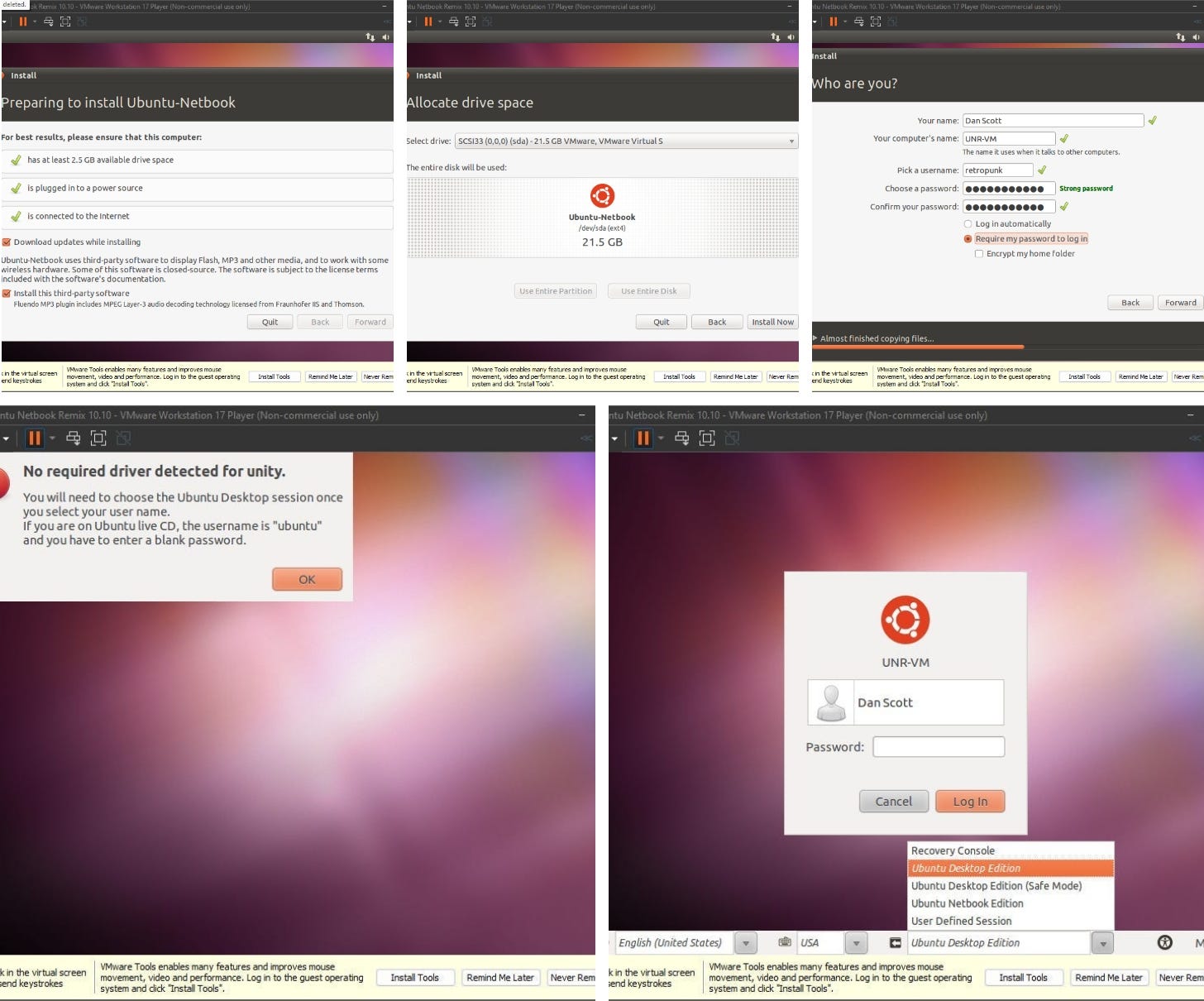 Installing Ubuntu Netbook Edition 10.10 As you could see from the screenshots, I got an error stating “No required driver detected for Unity”. I’m not sure what exactly that meant, but it stops you from loading into the netbook edition at all. Now, speaking of screenshots, not being able to boot into the correct desktop session made getting them problematic, so I turned to the interwebs. However, I was confused at what I found. This is what I remember from my time with UNE back in 2010. It’s pretty much the same as UNR 9.10 but with a lot more purple and a lot less orange. However, the screenshots people were sharing online were telling a different story. Now I know that Canonical was working on Unity at this time, but I don’t recall ever seeing anything that looked like Unity in the netbook edition. Maybe people on the internet are mistaken. Maybe I’m wrong and just Mandela effect’d the whole thing. Either way, the only way I can use this VM is in the standard Gnome 2 desktop session, so it’s a bit of a bust. Just know, there was a netbook edition in 2010. EasyPeasy lemon squeezyFinally, it’s worth mentioning that the Ubuntu Netbook Remix/Edition had forks out there as well. Pictured below is a project that was originally known as Ubuntu Eee. It came out in 2007 and was discontinued in 2013 under the name EasyPeasy — the name had to be changed after Canonical brought up the whole copyright issue with the name Ubuntu. The system could obviously run in Gnome 2, but here is a picture of what their netbook interface was. Again, more of the same, just a lot more green. Oddly enough, the project’s developer published a blog post on June 19, 2023 — nearly 9 years after the last post — on how to delete a file on Linux. What does that have to do with what we’re talking about? Nothing. I just thought it was odd and worth mentioning. In closing, the Ubuntu Netbook Edition is long since dead. It was a flash in the pan just like the devices it was intended for, but it was a unique take on how computing could or should be done. They took a chance and created a desktop interface that I think was really quite unique. At the time I used it for a little bit, I did not like it very much. I thought it was a little too limited and it was just too much of a departure from the traditional desktop paradigm at the time (remember I had just left Windows XP a few months prior). Looking back, though, I think my opinion on it has changed. Is it a perfect setup? No, but overall, I would say it was thoughtfully laid out to make the most out of the limitations of a netbook. It also strikes me as an interface that might lend itself quite well to someone who isn’t as tech savvy. Just choose the category you want, and pick the app. In some ways it feels a bit like modern tablets. Give it a try sometime and let me know what you think. You're currently a free subscriber to The Retro Millennial. For the full experience, upgrade your subscription. |
