Welcome to all our new readers joining us after we made it to Substack’s leaderboard for top tech newsletters (!!) If you’re new here, here’s what to expect:
Today’s issue is one of those behind-the-scenes stories. It’s Part 2 of a series on how we created our new landing page. If you missed Part 1 (on finding Sublime’s essence), you can catch up here. P.S. If you're a founder, designer, or just brand-curious, we're sharing all of the prompts, tools, and inspo you need to recreate bits of our process at the end of this piece. Enjoy <3 Vision is a VerbWe ended Part 1 with hard-earned clarity. Finally, we’d found the essence for the new landing page. We had the positioning, the copy, and a working headline. But when we materialized it in design, something felt off.
See? The site didn’t feel elevated enough to match how far the product had come. Safe, but no cigar. The way Part 2 ends isn’t a secret—our new landing page is up and live for the world to see.
This is the story of how we got there, from A to B and the C through Z detours we took getting there. It’s a story with three main players: Sari, Gabriel, and the ringer they’d bring in to finish the job.
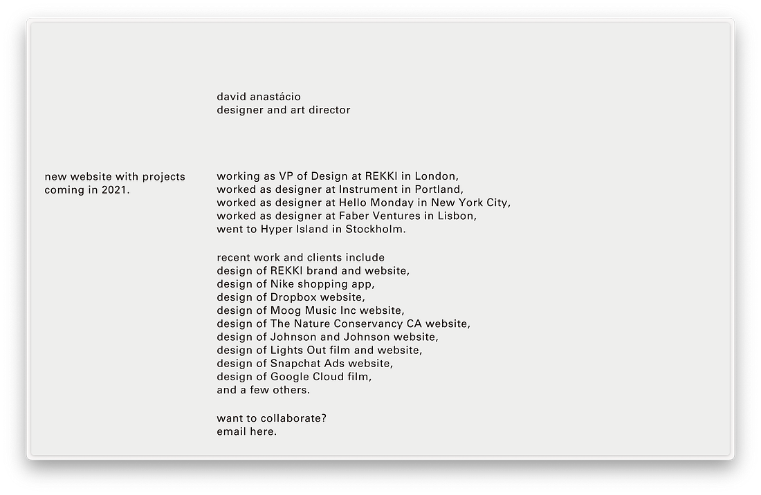
It's about vision that’s less of a noun and more of a verb—a way of being. The RiskWith little over two weeks before launching Sublime to the world, Sari and Gabriel had a decision to make. They could have kept the design of the new website in-house, stuck to the plan, and got it done. Or they could put out feelers… Well, one feeler. To David Anastácio, a designer who had been in Gabriel’s orbit since 2022 and who he admired. He’d discovered David’s work via the short film he'd made for Rekki. Whoever cared to invest in this sort of thing, Gabriel thought, must know what's up.
Gabriel could have kept searching, but…when you know, you know. If David was free, he was our person. He was free. He was our person. (We've included the proposal he sent for paying subscribers at the end of this piece.) Week OneWith a two-week deadline before launch, most designers would move fast and dive into Figma—design, iterate, and deliver. A soft-spoken artist covered in a precise arrangement of tattoos, David did the opposite. He spent the first few days asking questions, reading everything we'd written—articles, testimonials, stray notes, love notes—everything. He cared for the story, the feeling, the frequency of it all. What could Sari and Gabriel do but trust that the visuals would come. I asked Sari if she felt nervous.
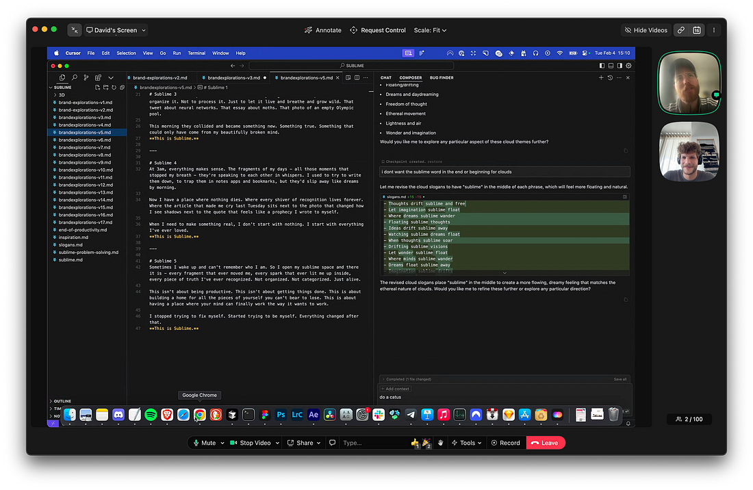
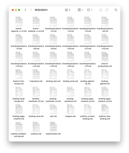
Meanwhile, David was playing around with new words and language to describe Sublime in, of all places, Cursor, the AI-powered code editor. (??!!)
He'd loaded the code editor thing with everything he'd found; brand voices he admired, what we’d shared, random raw resources…and all that served as the foundation to then start prompting the AI.
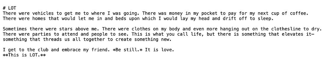
David knew what he wanted; something…Short. Poetic. Punchy. Something like this:
Having fed all of that context to Cursor, he started prompting the AI. He refined and refined some more. V2 became V27. Finally, things started feeling right. He dropped the poetic brand statements into a shared Sublime collection.
"I LOVED these," Sari said.
Why spend time on words that wouldn’t make it onto the landing page itself? The ground was fertile. The good stuff could grow. (Paying subscribers get a video clip where David walks through how you can generate similar poetic brand statements for your product or brand—see a little preview below.) No EgoSari and Gabriel thought they’d now dive into visuals and get the website done. But no, not exactly. Not just yet. David became obsessed with the Sublime logo (designed by Bate, the creative studio we'd worked with for our first landing page.)
There was something about the logo that kept pulling him in. It didn’t feel SaaS. It was layered. In an act devoid of ego, David took this symbol, this thing made by other designers, and expanded on its essence. He carved a 3D object out of it, and started playing with this crazy AI tool called ComfyUI to transform the logo into various materials.
Concrete, glass, chrome, gold, corn, ice. Every few hours, a new image landed in Slack.
But one felt most alive: moss, green, rocks, earthy stuff.
This right here, this was it. We’d long believed that tending to your knowledge mirrored tending to a garden—the earthy, messy care and love of a place where the result is unknown—some ideas wither, others thrive. Now, our logo embodied it. Except wait. The H1 "not another boring knowledge tool" no longer made sense. What about "The knowledge tool that sparks joy"? Closer. Good, at least for now. Week Two…and on the seventh day David said, let there be visuals. Far from orderly, but visuals nonetheless.
From there, subtle, intentional choices became easier to make. Why make everything lowercase? Because it felt softer, more approachable, less like a tech product and more like a creative tool.
Why Times New Roman for the manifesto? Because it's classic, literary, and a little bit rebellious in a world of sans-serif sameness.
Why the easter egg butterfly to take you to the head in the clouds manifesto? Because it felt right. Because when you know, you know.
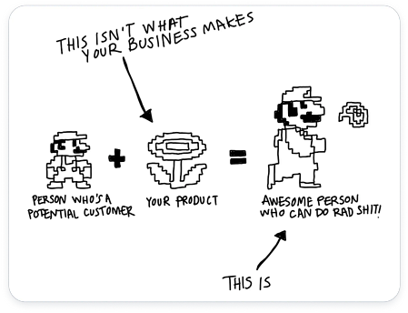
When You Think It’s Done…As things fell into place we looked at the headline again—'the knowledge tool that sparks joy' and something felt off. Sari looked back at the Mario meme.
What did Sublime help Mario become? Creative. Joy was broad, creativity felt specific. Obvious in hindsight, nailing the headline took time. The process mirrored the way we’d built the entire landing page: follow the feeling. In the coming age of AI-assisted work, vision becomes everything. Without vision, you end up with iteration soup. With it, you can take risks knowing that while you may not know exactly where you’re headed, you’ll know it when you get there. When you know, you know. For paying subs — we've bundled up everything you need to recreate bits of our process for your product or brand. Here’s what you get:
Subscribe to The Sublime to unlock the rest.Become a paying subscriber of The Sublime to get access to this post and other subscriber-only content. A subscription gets you:
|